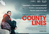
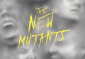
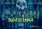
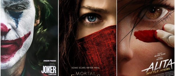
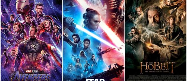
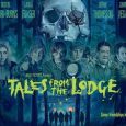
There is a lack of creativity in poster design today. In terms of the mainstream studio movies especially, there is very little variation. Popular tropes that we see movie posters constantly imitating today include the “half face” poster, often reserved for dramas or anything with a tone that can be described as “gritty”. Or the approach of any self titled blockbuster, from Marvel to the depressing revival of long dead franchises, which is to simply throw the entire cast on a sheet of A4 in a indistinguishable clutter.
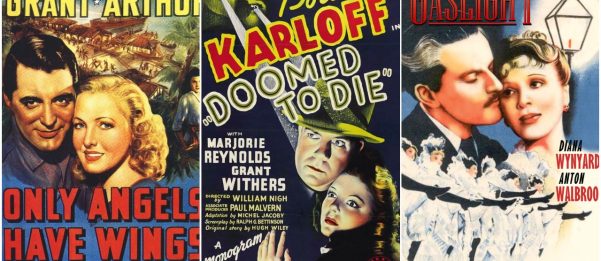
That’s not to say posters of the past have always been beautiful and artistic. Before the 1950s they suffered from the same problem of the blockbusters today. A poster was an afterthought. Simply throw up the lead actors faces, their names, and a basic artistic representation of what the film is about (e.g female lead with her head on the shoulders of a man if it was a romance) and you’re set. The poster did not tell you anything other than who was in it and what genre the film likely belonged to. Looking at these posters from the 1940s and today, it’s surprising how strikingly similar they are. They have the same issues. As a fun little game ask yourself if these posters tell you anything about the film other than the genre and who’s in it.
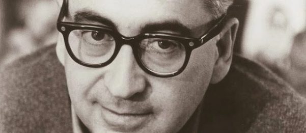
There are of course exceptions today and throughout film history, but overall film posters were at their height of artistic beauty between the 1960s to the beginning of the 1980s. But there were rumblings of creative defiance in the 50s also. Most famously from graphic designer Saul Bass, whose minimalist, modern style was a breath of fresh air for the industry.
It’s difficult to quickly sum up the sheer volume of work Saul (along with his wife Elaine from 1960) produced. For film alone he created various posters and ad campaigns. He designed and shot many opening title sequences that are now classics, as well as serving as a design consultant on many films. He even devised and story-boarded the famous “shower scene” in Hitchcock’s Psycho before directing a handful of short films and one feature later in his career.
Outside of Hollywood, Saul created countless corporate logos and identity programs, many that are still in use today. He did extensive work in Japan and is even responsible for the design and layout of the modern petrol station. But I am going to focus on his poster design and highlight some of my personal favourite work of his in this field. Some are his most famous works and others were never even used publicly. But all offer an insight into the minimalist genius of Saul Bass.
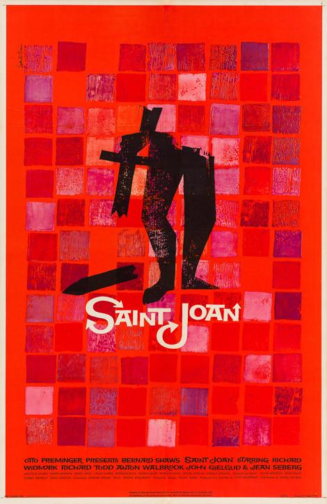
1. Saint Joan
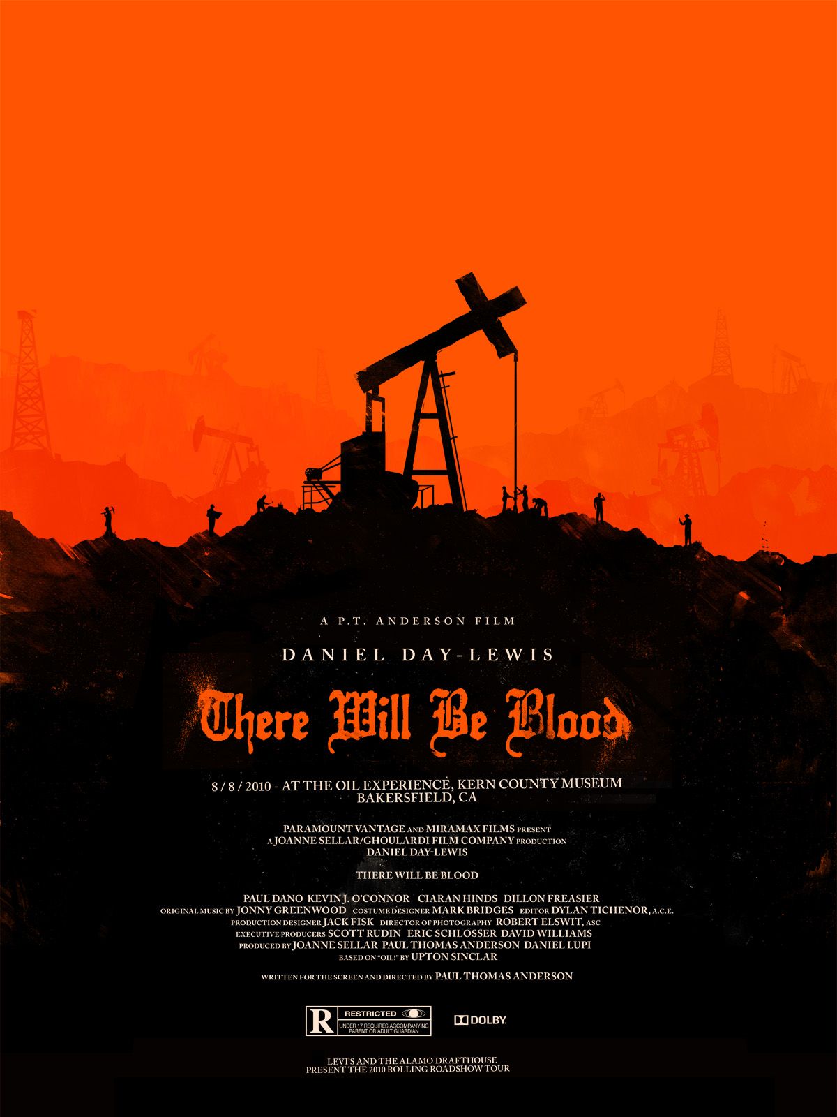
This brilliantly unconventional poster for 1957s Saint Joan would look more fitting hung up in a gallery over a movie theatre. It’s perhaps one of Saul’s most ambiguous posters that feels caught somewhere between a historic and modern world. The symbol of the broken body of a Joan of Arc is set in front of a colourful mosaic, reminiscent of the stained glass windows of medieval cathedrals of the time. The broken sword also doubles as a cross, suggesting the fragility of the church (something borrowed by Paul Thomas Anderson in the poster for There Will Be Blood). These subtle hints (like little Easter eggs) are often rife in Saul’s posters, and offer a deeper, albeit unconscious insight into the films themes.
2. The Big Country
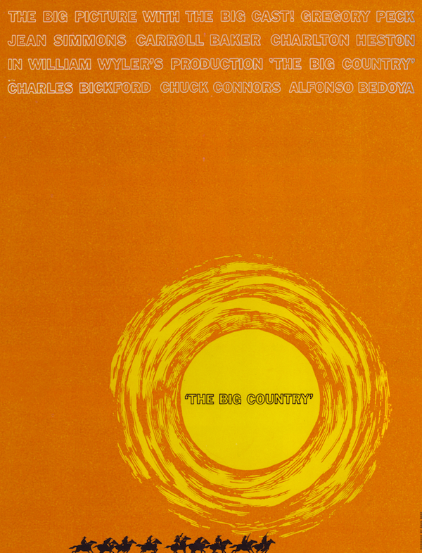
Saul created the title sequence and advertising campaign for the Gregory Peck led Western The Big Country. His trademark minimalist style has never been better here, perfectly capturing the epic expense of location within the American west. It’s quite clear just from this image what kind of western this is. A big, sweeping and romantic drama about a cultured easterner trying to make peace between two western families fighting over water rights. Although Saul’s designs were used in the ad campaign, the studio decided to only use particular elements of the imagery and this minimalist poster was deemed too risky to use.
3. Vertigo
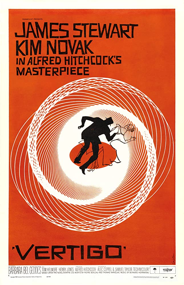
Among the repertoire of Saul’s work, his title sequence and advertising campaign for Alfred Hitchcock’s masterpiece Vertigo are among the most celebrated. Bemusing contemporary audiences, the poster at least caught people’s eyes as it’s become one of the most famous and most deeply appreciated movie posters of all time. Bass encapsulates the sensation of vertigo by having the two middle figures being sucked into an eye like vortex. The male figure is shaded in harsh black, whilst the woman is left looking like an apparition with her light outline. The slightly off kilter font used is striking but further proof of the films disjointed and confused psychological narrative.
4. The Magnificent Seven
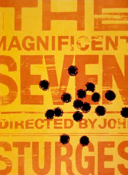
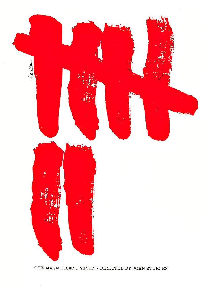
This now famous Hollywood Western based on Akira Kurosawa’s Seven Samurai originally had two posters designed by Saul Bass. Unfortunately neither were used as the studio had trouble accepting something so different from the typical advertising for action packed westerns featuring major stars. Both posters are stunningly reductive, the first a bold “wanted” poster riddled with bullet holes; the other marks the number seven in the style reminiscent of Japanese calligraphy.
5. Schindler’s List
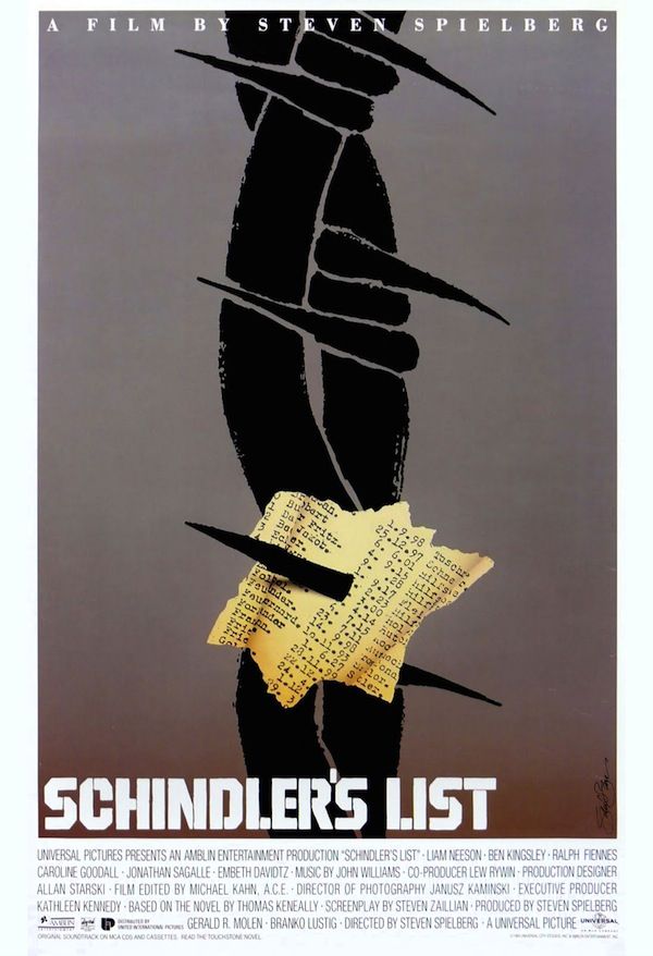
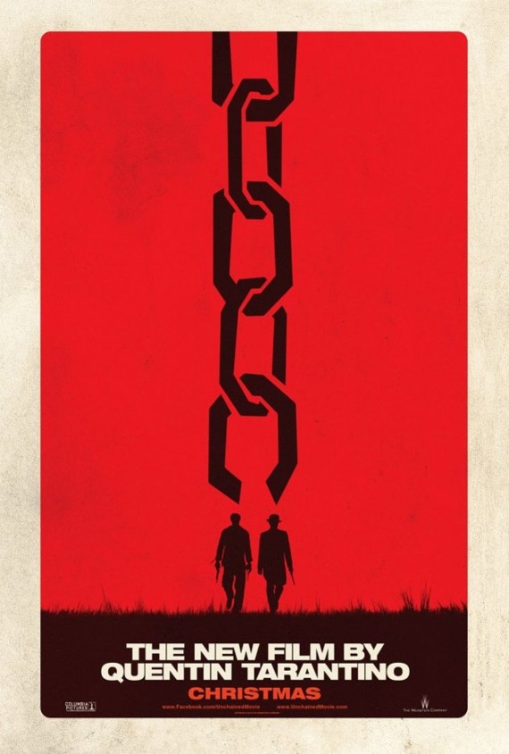
Yes that’s right, before his death in 1996 Saul designed a poster for Steven Spielberg’s Holocaust drama Schindler’s List. More than likely you’ve never seen this poster, because yet again it was rejected and never used. It’s unclear whether Universal or Spielberg himself rejected Saul’s design, but it is clear that they decided to go for a more conventional, optimistic design. The final poster used for Schindler’s List shows the hand of a child (the red coat girl) being saved by another individual (presumably Schindler). Although this never happens in the film, the complete opposite in fact, the image stirs up emotions of hope against adversity. It’s a competent but somewhat safe poster. Saul’s on the other hand is incredibly bleak, with barbed wire piercing Schindler’s famous list (subtly in the shape of the Star of David) to create a much more pessimistic tone. It’s arguably much harder to market Saul’s poster than what the final design became, but there is something more horrifically truthful about the Bass design. Despite never being made an official poster, it clearly has its fans as Quentin Tarantino would go on to make a clear copycat poster for his film Django Unchained.
The fact that Saul Bass posters are continuing to influence poster design today is a clear showcase of his timeless talent. His posters don’t age like those of the pre-1950s. They work as a piece of art first, and an advertisement second, which surely is the ideal situation. In the online age there are now more independent artists then ever before creating alternate posters for films. These are almost always more appealing than the official output. The amount of work on Mondo alone is baffling, yet studios carry on churning out factory made, lifeless posters. Maybe that’s how it’s destined to stay for the time being. Or perhaps the film world is just waiting for the next Saul Bass to come along and shake things up.

